This option enables a weighted annual calculation of seasonal patterns. Older data (price movements) are multiplied by a value smaller than 1 and receive a lower significance in the overall calculation. This makes it easier to identify seasonal trends that have weakened in recent years.
-
All values from the last 2.5 years: * 1.5
-
All values older than 2.5 years: * 1.35
-
All values older than 5 years: * 1.25
-
All values older than 7.5 years: * 1
-
All values older than 10 years: * 0.8
-
All values older than 12.5 years: * 0.65
-
All values older than 15 years: * 0.45
The weighted annual calculation does not have any effect on the price list or the profit and loss trades.
For example: If you want trades to be opened only when the price is above the 200 day moving average, tick the checkbox "Price is higher then SMA 200" and tick "Entry" in the same line.
This instrument is for members only.
As a member you get access to all instruments.
Furthermore, as a member you have full access to our powerful Screener and Seasonality Comparison Tool.
The combination of the tools makes recurring patterns (seasonality) so valuable.
As a member you will regularly receive selected trading and investment opportunities.
Hundreds of very good entry and exit points are stored in our database.
Use our screener to take full advantage of the potential of recurring patterns.
Chart features:
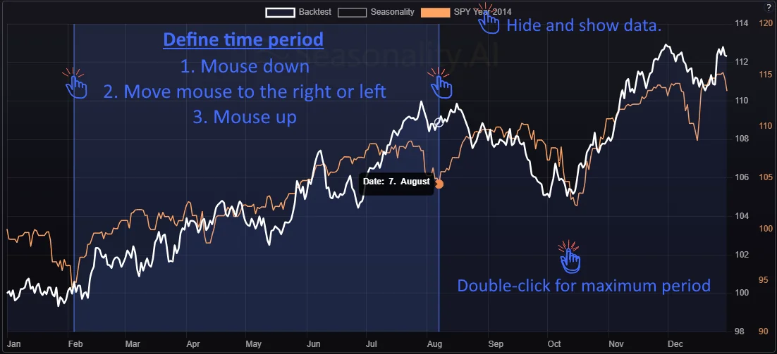
- Drag and drop on the seasonal chart define the analysis period.
The down-click represents the start. Releasing the mouse (up) cursor establishes the end of the analysis period. - Mouse down
- Move mouse to the right or left
- Mouse up
- Double-click on the chart to select the maximum backtest period.
- Clicking on the label in the legend shows and hides the respective data.
The image shows the three steps:

The seasonal chart shows the average price trend for the selected history and backtest period (full color).
Backtest Result Key figures:
Summarized profit: Profit of the selected period of all calculated trades.
Winning trades: Percentage number of positive trades.
Average / Median profit: Average & Median profit of the selected period of all calculated trades.
Max drawdown: Maximum loss period in the summarized profit.
Sharp ratio: The sharp ratio shows the quality of the summarized profit in terms of profit and drawdown.
Sortino ratio: The sortino ratio shows the quality of the summarized profit in terms of profit and drawdown. The Sortino Ratio is the preferred metric for us because it does not negatively factor in positive volatility.
Count trades: Number of trades.
Gains / Losses: The number of trades won and lost.
Backtest: Selected Period Trade Simulation: The next two charts show the result of simulated trades, which were started at the beginning of the selected period and ended at the end of the period.
In the bottom table of the analysis you can find a list of individual trades with further details.
Summarised profit: The performance chart shows all transactions in a performance curve. The chart simulates the result if every trade on the instrument would have been bought at the beginning of the selected period and sold at the end.
Backtest Result Key figures:
Max drawdown: Maximum loss period in the summarized profit.
Summarized profit: Profit of the selected period of all calculated years.
Sharp ratio: The sharp ratio shows the quality of the summarized profit in terms of profit and drawdown.
Sortino ratio: The sortino ratio shows the quality of the summarized profit in terms of profit and drawdown. The Sortino Ratio is the preferred metric because it does not negatively factor in positive volatility.
Count trades: Number of trades.
Improvement: The ratio shows how much the seasonal trend has improved from half of the selected period. A high number is a positive sign.
Profit & losses: This bar chart shows the gains or losses of each trade if the instrument had been bought at the beginning of the selected period and sold at the end of the period.
Backtest Result Key figures:
Average / Median profit: Average & Madian profit of the selected period of all calculated trades.
Winning trades: Percentage number of positive trades.
Gains / Losses: The number of trades won and lost.
Last trade: Max drawdown: The maximum loss of the last trade that occurred during the holding period but was not realized.
Last trade: Profit: The Profit of the last trade.
Trade simulation of the selected period (Trade List)
Trade simulation of the selected period (Trade List): The table shows the list of simulated trades that started at the beginning of the chosen period and ended at the end.
Trade simulation of the selected period (Trade List): The table shows the list of simulated trades that started at the beginning of the chosen period and ended at the end.
| Symbol | Startdate | Startpprice | Enddate | Endprice | Change | Change % | Maxrise % | Maxdrop % |
|---|
Chart features:
- Drag and drop on the seasonal chart define the analysis period.
The down-click represents the start. Releasing the mouse (up) cursor establishes the end of the analysis period. - Mouse down
- Move mouse to the right or left
- Mouse up
- Double-click on the chart to select the maximum backtest period.
- Clicking on the label in the legend shows and hides the respective data.
The image shows the three steps:

The seasonal chart shows the average price trend for the selected history and backtest period (full color).
24-Mar to 1-Dec, 10y, Long Trades
Seasonal Statistics: The following four charts show the seasonal evaluation for each year, month, week, day of the month, and day of the week.
Yearly Seasonality: The chart shows the annual seasonal pattern of the selected period. This seasonal data is essential for a detailed analysis. With this chart, you can see which year offers opportunities or risks.
Monthly Seasonality: The chart shows the annual seasonal pattern of the selected period. This seasonal data is essential for a detailed analysis. With this chart, you can see which month offers opportunities or risks.
Weekly Seasonality: The chart shows the annual seasonal pattern of the selected period. This seasonal data is essential for a detailed analysis. With this chart, you can see which week offers opportunities or risks.
Daily Seasonality: The chart shows the annual seasonal pattern of the selected period. This seasonal data is essential for a detailed analysis. With this chart, you can see which day offers opportunities or risks.
Weekdays Seasonality: The chart shows the annual seasonal pattern of the selected period. This seasonal data is essential for a detailed analysis. With this chart, you can see which weekday offers opportunities or risks.
Monthly Statistic: The statistics show the average monthly performance and the percentage win rate, whether the month had a positive or negative final result. Furthermore, the best and worst months are displayed, including the years they occurred.
| Jan. | Feb. | Mar. | Apr. | May. | June | July | Aug. | Sep. | Oct. | Nov. | Dec. |
|---|
| Jan. | Feb. | Mar. | Apr. | May. | June | July | Aug. | Sep. | Oct. | Nov. | Dec. |
|---|
Intraday Seasonality Chart: Intraday data of the last days. The result of the intraday data can be limited by the "Day per Month" and "Week day" analysis and by the "Exclude month" and "Exclude week days" specifications.

